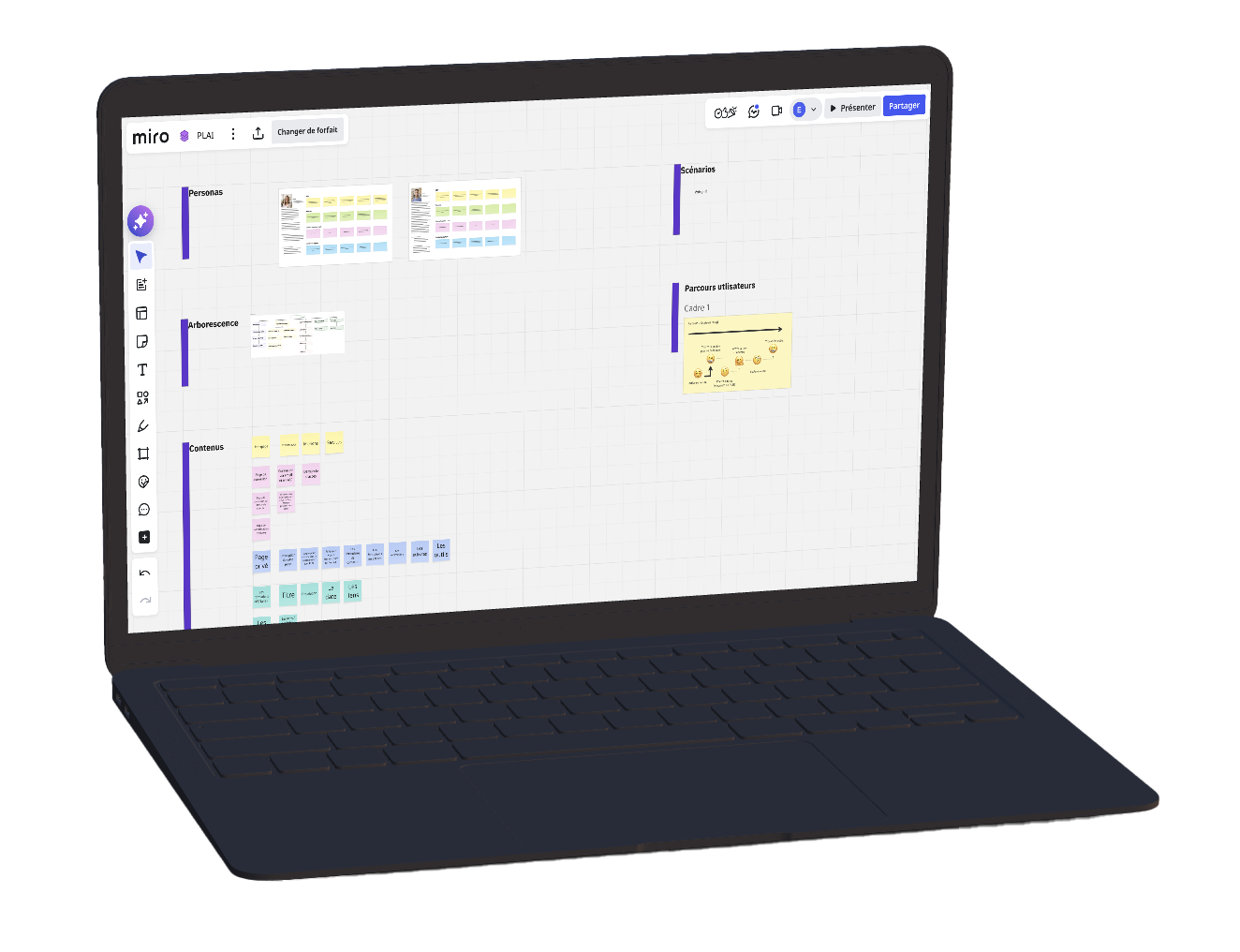
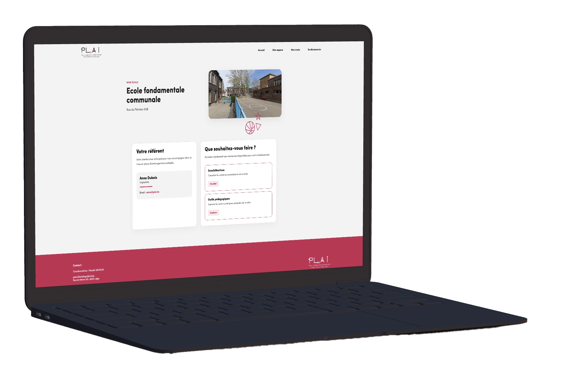
Client Project

Client Project

Completed on May 31, 2026

Visit website

Étapes du projet

1/6

Who is the client?

PLAI is an organization specialized in supporting more inclusive education.
Its mission is to help teachers and schools better understand learning difficulties and inclusion-related challenges.

The website needed to communicate a professional, human, and accessible image while making information easier to understand and navigate for different types of users.

Logo PLAI
2/6

The challenge encountered

One of the main challenges of the project was understanding the client’s real needs.
Because the field of inclusive education is very specific, it was important to first understand the sector, the expectations of teachers, and the difficulties they face on a daily basis.

The most difficult part was not only designing or developing the website, but truly understanding what the users and the client actually needed in order to create a relevant and useful solution.

a vectorial image, with a person who is thinking
3/6

UX analysis and research

Before starting the design phase, several analyses and research steps were carried out to better understand the project and its users.

The UX work focused on: studying personas, creating user scenarios, organizing the website architecture, discussing with people working in the field, improving accessibility and readability, simplifying navigation.

This phase helped build a solid foundation before moving on to the interface design.

plai - laptop and all UX research
4/6

Artistic direction and interface

The artistic direction of the project had to remain simple, clear, and accessible.

The client wanted an interface that was easy to understand, without unnecessary visual overload or complicated navigation.
The goal was therefore to create a smooth and reassuring user experience with a clean and intuitive structure.

Special attention was given to: content clarity, spacious layouts, simplified navigation, visual consistency between pages, responsive usability on desktop and mobile devices.

laptop and the moodboard
5/6

Project development

The website was then developed based on the structure established during the UX/UI phase.

Particular attention was paid to, code organization, responsive design, accessibility, performance optimization, visual consistency across all pages.

The website was designed to provide a fluid experience on desktop, tablet, and mobile devices.

To learn more about the code and discover the full project, I invite you to visit my GitHub repository.

laptop and the code in the php storm
6/6

Difficulties encountered

The project already had a solid content base, but some information was still limited during the design phase.
It was therefore necessary to create a flexible structure that would allow future sections and new content to be added easily.

The website was designed as an evolving platform that can continue to grow and adapt according to the client’s future needs.

lapton and the final effect of the privet page; the school page